Hello!
I'm a Game Designer located in Helsinki, Finland.
Professional Projects
Merge Mansion
Mystery Puzzle Game
| My position | Game Designer |
|---|---|
| Time frame | Since April 2024 |
| Genre | Relaxing mystery merge-2 game |
| Platforms | Android and iOS |
| Target group | Middle-aged women |
| Other direct team members | 2 Content Designers, 2 Narrative Designers, 1 Programmer, 2 QA, multiple Artists, 2 Producer, 1 Product Manager |
| Software | Unity, Notion, Miro, Config tool, Internal unity tooling, GitHub and git, Localisation tool |
| Company | Metacore Games Oy – Helsinki, Finland |
| My tasks |
|
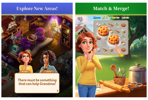
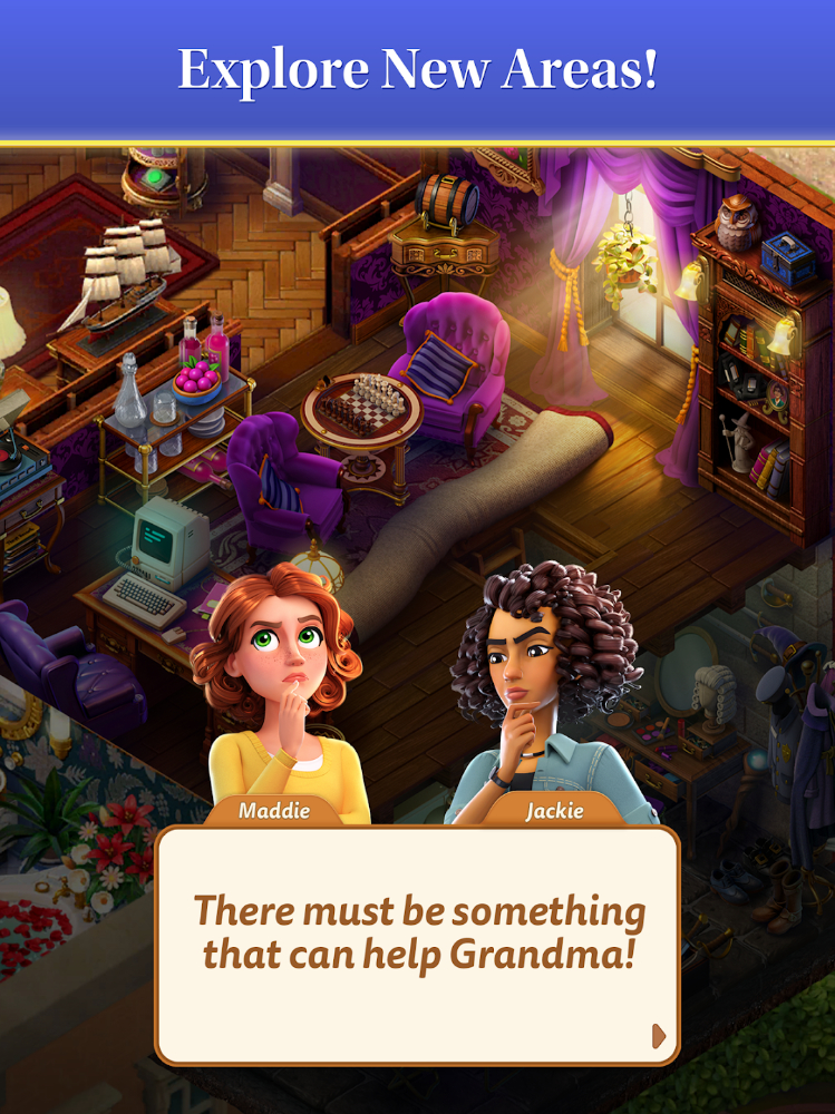
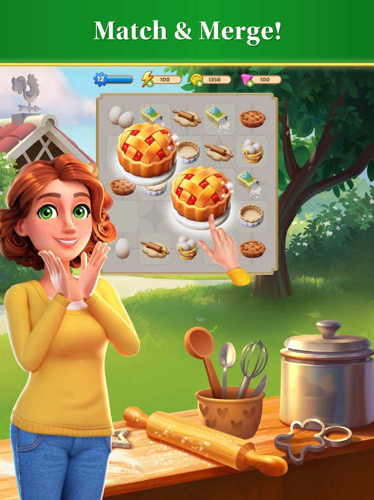
Merge Mansion is a mystery puzzle game where you'll join Maddie Boulton on her quest to uncover Grandma's secrets by renovating the Boulton family estate.
As a designer who had always worked in small teams and companies, it was a big adjustment for me to suddenly be part of such a large game team and work on a live game.
But I quickly became a valued team member and was responsible for the design tools and the transition from the old to the new pipeline. I specified new tools to reduce the time needed to create an area and worked closely with multiple developers.
And we succeeded: We managed to reduce production time by about 40%. We also changed the workflow so that area-creation is design-driven and we have more control, which concludes in a better user experience.
I am now part of a small team that is exploring ways to reuse more assets, further reduce production time, and still deliver high-quality areas for our players.
The first area I worked on was the Music Studio, an area that has some interesting hidden details that required clear communication and documentation in order to function well in production.
One of my most recent areas are in the Tin Can Factory location. My favourite area is not yet live, so stay tuned! But my favourite item chain is the one in the Boulton Boulevard: it's the first time we introduced animated producers on the merge board!
Project Wonderworld
Massive Local Multiplayer
| My position | Junior Game Designer |
|---|---|
| Time frame | July 2022 - December 2022 |
| Genre | RPG on a shared screen, using multiple platforms and hybrid game loops |
| Platforms | Nvidia shield + TV, iPadOS, android |
| Target group | children from 7 to 12 |
| Other team members | 1 Lead Game Designer, 2 artists, 5 programmers, 1 QA manager, 1 product owner |
| Software | Docs, Sheets, Notion, Miro, Unity, Asana |
| Company | Wondershop Oy – Helsinki, Finland |
| My tasks |
|
We were developing a new gaming experience for kids with a unique controller.
Players play together on a shared screen in a public venue. The goal is to create fun,shared experiences. Each venue, the so-called hub, brings something unique to the game.
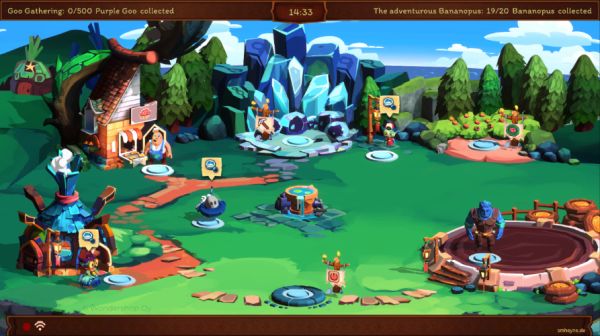
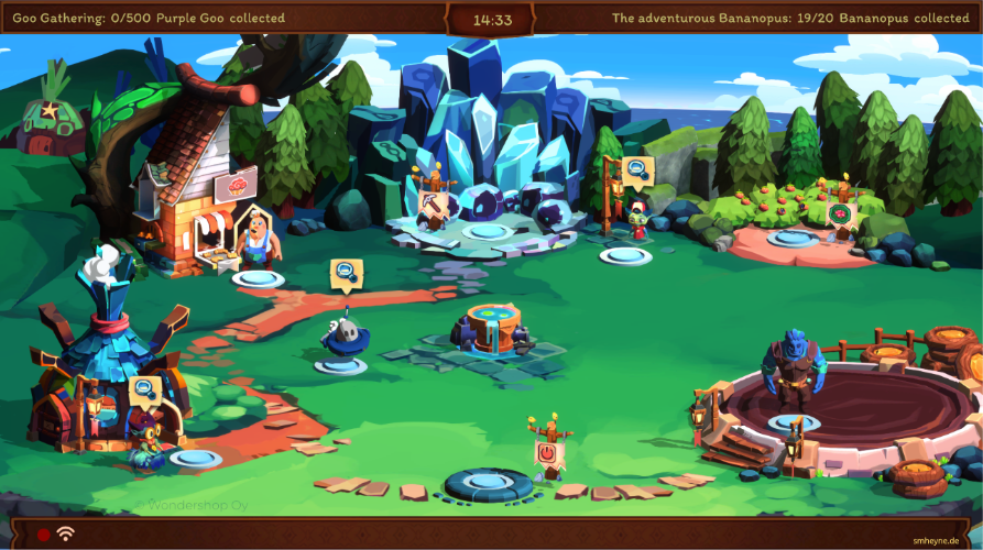
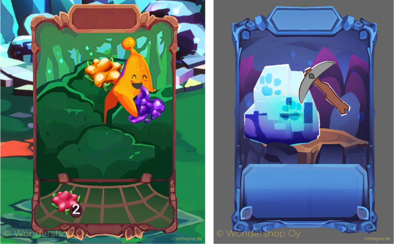
The game concluded multiple platforms, two of them were the Player Console and the here-shown Game Screen. The Game Screen is for the shared experience with other players on-site. The Player Console is for resource management, everything social and individualisation of your player character.
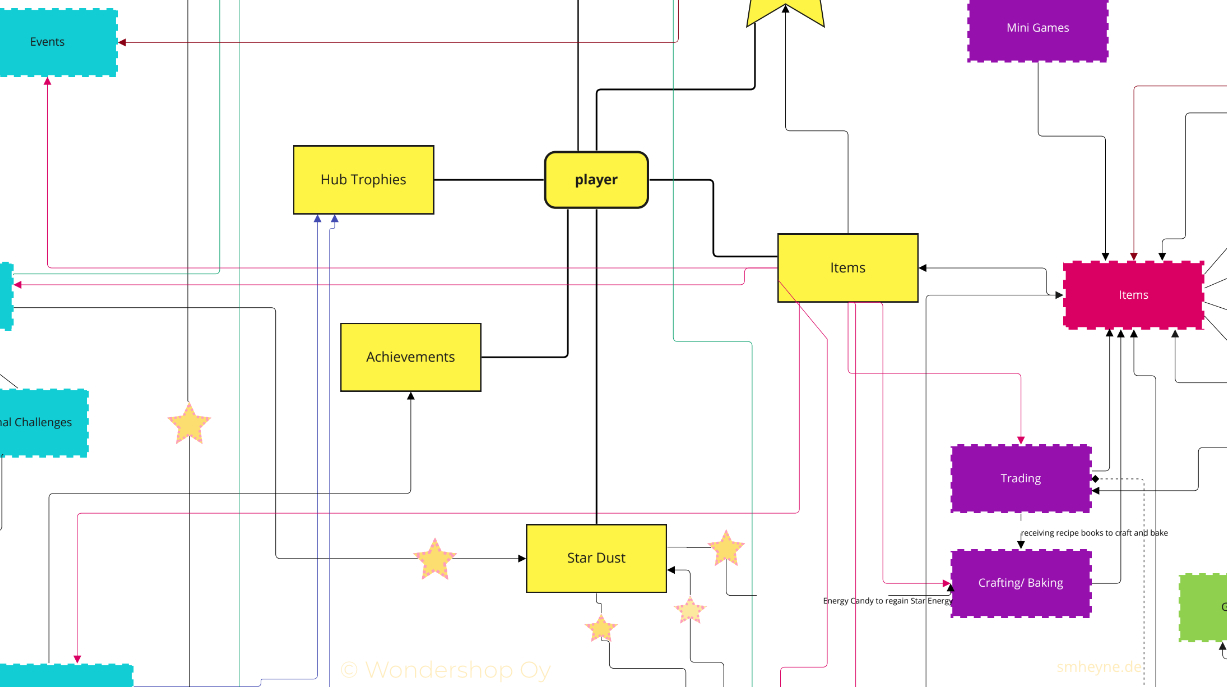
The unique part of the game was that the in-game and physical worlds were intertwined. Real-world activities help you progress in the game. As I first studied digital installation design and have experience with physical games, I designed how these connections work and when the players should end their digital session to continue in the real world.
However, my primary responsibility in the project was the Player Console. The player handles everything personal here. The first version felt more like a tool than a part of the game, as it was less playful. Additionally, accessing all the features the player was supposed to find easily here took a lot of effort.
I proposed a new start page that had a different layout. I suggested that based on multiple personas I made with the team's help at our test hub. I've constantly exchanged with the developers and artists implementing the changes.
.png)
.png)
.png)
.png)
.png)
Sherlock Holmes Scotland Yard
Deduction Board Game
| My position | Game Development Intern |
|---|---|
| Time frame | April - July 2022 |
| Genre | Deduction game |
| Platform | board game |
| Target group | families with children older then 10 |
| Company | Ravensburger – Ravensburg, Germany |
| Software | Proprietary text setting tool, Word |
| Other team members | 2 Game Development Managers, 1 Art Director, 1 Art Department intern + working with multiple other departments in the end for the final product |
| Published | 2022 |
| My tasks |
|
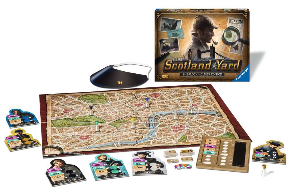
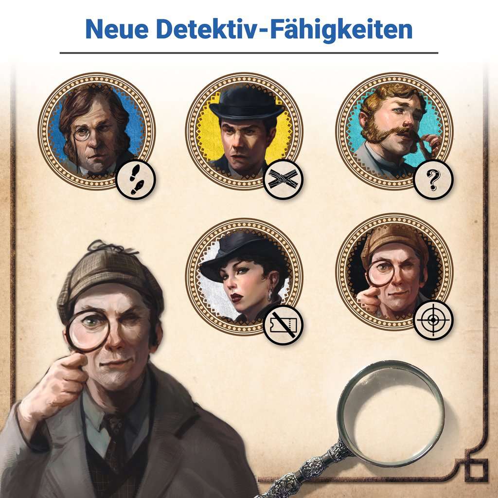
When I joined the project, the two Editors working on this project already developed the new character abilities for Holmes' Team. In the old version, one person played Mister X and could only win by escaping. Now, this player plays Moriarty and can also win by committing crimes.
But with the new player abilities, we realised during one of the many test sessions that Moriarty needs an escape strategy. These Moriarty abilities were my main tasks during the development. I chose the locations where Moriarty could land with his air balloon and helped figure out the crime scene areas on the board.
In the end, we decided to use Moriarty's start number tokens also for the landing possibilities, always having two options on one token. This way, we didn't need to set up a new layout for printing and could lower production costs.
In the end, I was even in charge of correcting the rules, coordinating with the art director for this project, checking the final print files, and writing instructions on setting up the rule book's explanation pictures.
Villewälder App
AR App with Serious Content
| My position | Game Designer Intern |
|---|---|
| Time frame | May - July 2019 |
| Genre | AR learning game |
| Platforms | android and iOS |
| Target group | families with children from 8 |
| Other team members | Supervising Lead Game Designer, 1 programmer, 1 artist |
| Software | Omnigraffle, Spine, Unity |
| Company | the Good Evil GmbH – Cologne, Germany |
| My tasks |
|
After a few weeks, I was in charge of this project. The Lead Game Designer reviewed my process with me weekly and advised on how to proceed. Besides that, I had absolute freedom and worked alone on the Game Design.
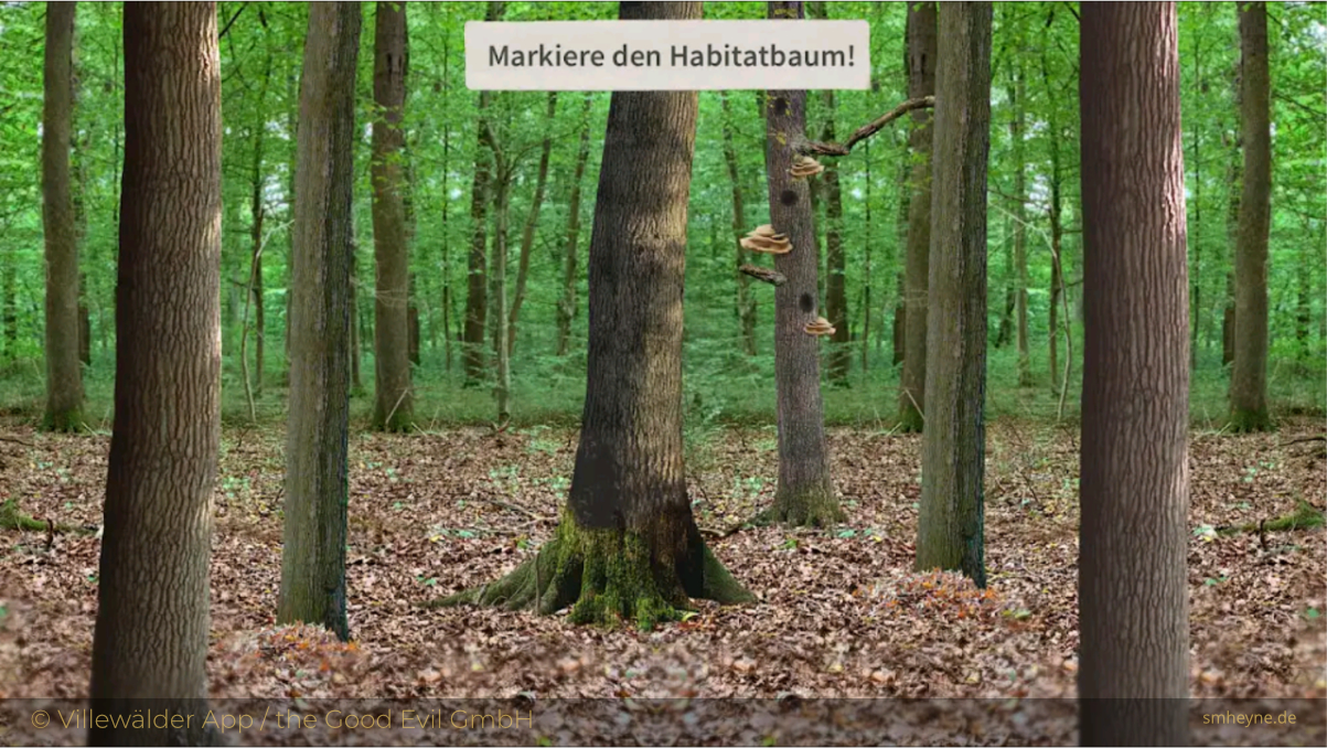
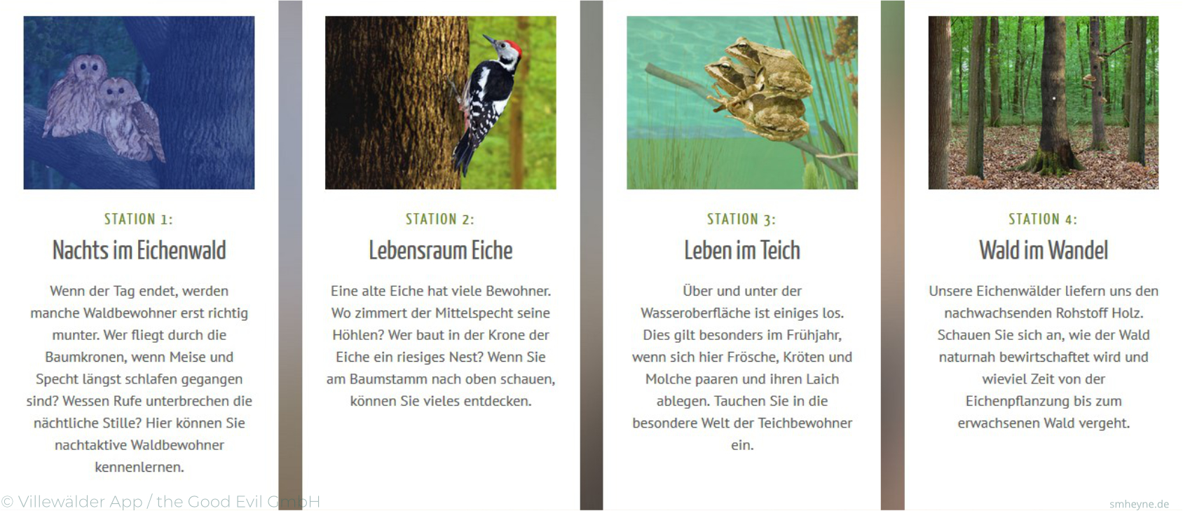
I knew which specific forest areas I needed to include in the game and which animals the visitors could find at these. My task was to figure out the possibilities with AR and what the player could do at these sites.
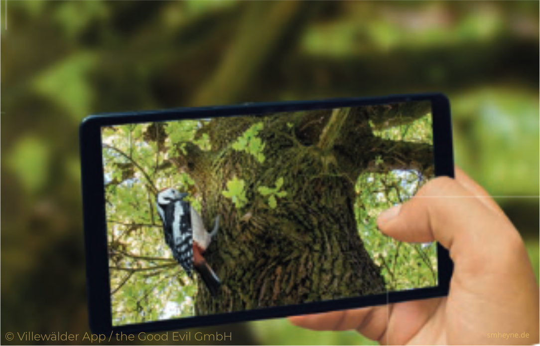
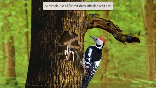
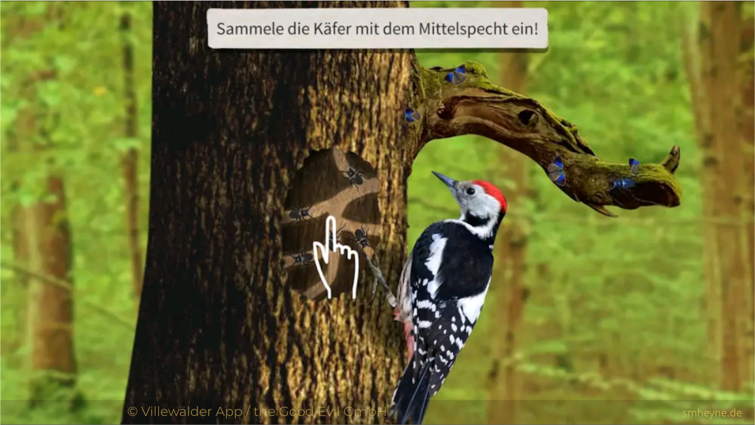
The interactions in the game are small: for example, the player searches with their phone on the trees around them for a place on which bugs could be so the woodpecker can find and eat them.
A short informational text informs the player about the specifics of the animal. Then, they can continue with the following small task. This way, the player learns much about the connections between the forest and the animals living there.
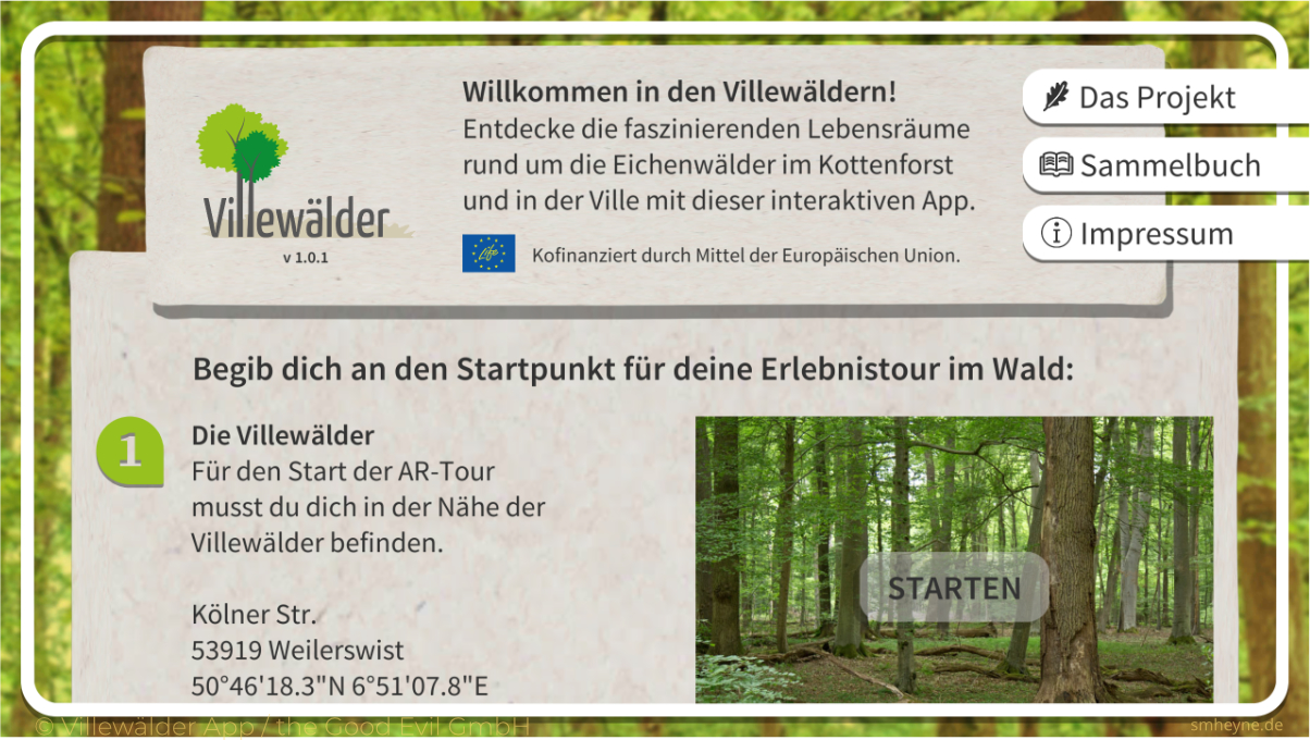
The game is supposed to be played while walking through the forest, and the stations are not directly next to each other. The main focus is still experiencing nature, and the players are encouraged to search for all the details revealing the animal's activities.
Bravori Music App
Gamified lesson tracking app
| My position | Team Lead and UX/UI Designer |
|---|---|
| Time frame | September – November 2023 |
| Genre | gamified music learning support app |
| Platforms | mobile and tablets |
| Target group | children learning an instrument with a teacher and music teachers |
| Other team members | Founders, Lead Developer, 6 part-time Developer interns |
| Software | Figma, Affinity Designer, Affinity Photo, Notion, Miro |
| Company | Bravori Oy – Helsinki, Finland |
| My tasks |
|
I orginally joined the team as a Game Designer, as the founders were planning on not only gamifying their app, but making it a serious game!
Unfortunately the project was not in that state yet and the core functionalities and user's needs not validated. The core functionality is the exchange between teachers and students about the lessons they are supposed to practice at home.
Problem statement:
Often teachers don't know what the students are really practicing at home. Do they practice at all? Is it fun? Too easy or too hard maybe? What is frustrating for the student?The teacher will only know next time when they meet!
And for the student it's similar: they can't get help when they are stuck, it's not that motivating to just repeat the same piece over and over without any positive confirmation.
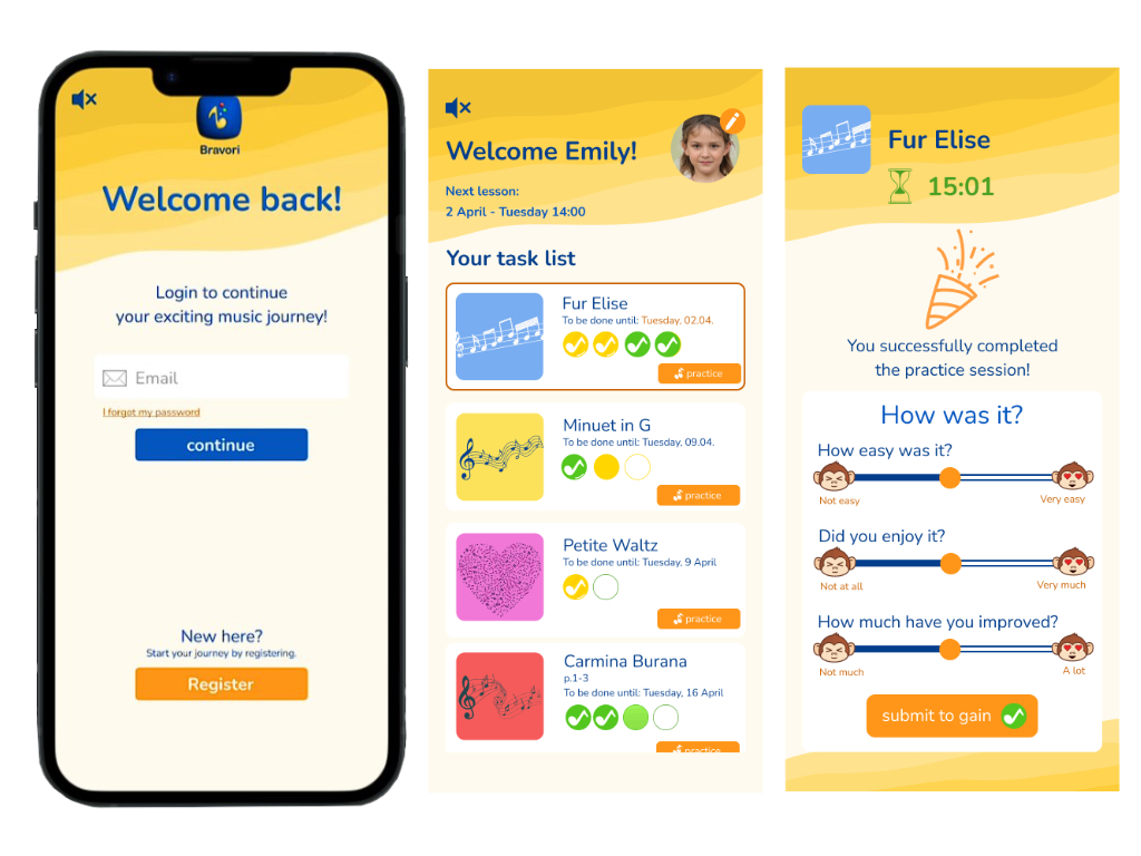
The Bravori Music App is planning to fill this gap with providing gamification and positive feedback for lesson completion and just for practising the instrument overall. And the teacher get's valuable feedback and can help way better.
So, I made it my task to ensure the core functionality is what the target group actually needs. Or let's say target groups. It's mainly the children, but the teachers will be the ones introducing the app to their students.
To test this core functionality I broke down all the ideas that were roaming around, figured out what we really need for the first prototype and started to build flow charts and wireframes.
At the same time I tried to get every team member on the same page, as we refactored the entire project. Thanks a lot to my colleague MJ for doing such a great job in helping all these young developers while refactoring.
Last but not least I was also organising and conducting user tests to understand, why students practice - or do not practice - currently, what other apps they use, what is fun for them, and so much more.
To sum it up:
It was a packed learning experience for me. I jumped into the project to do Game Design and, in the end, built a clickable prototype in Figma to test with our target group and make sure the team has a clear goal towards which they are heading.Parlamus
Casual Mobile Strategy Game
Parlamus
Casual Mobile Strategy Game
Screenshot from the html version
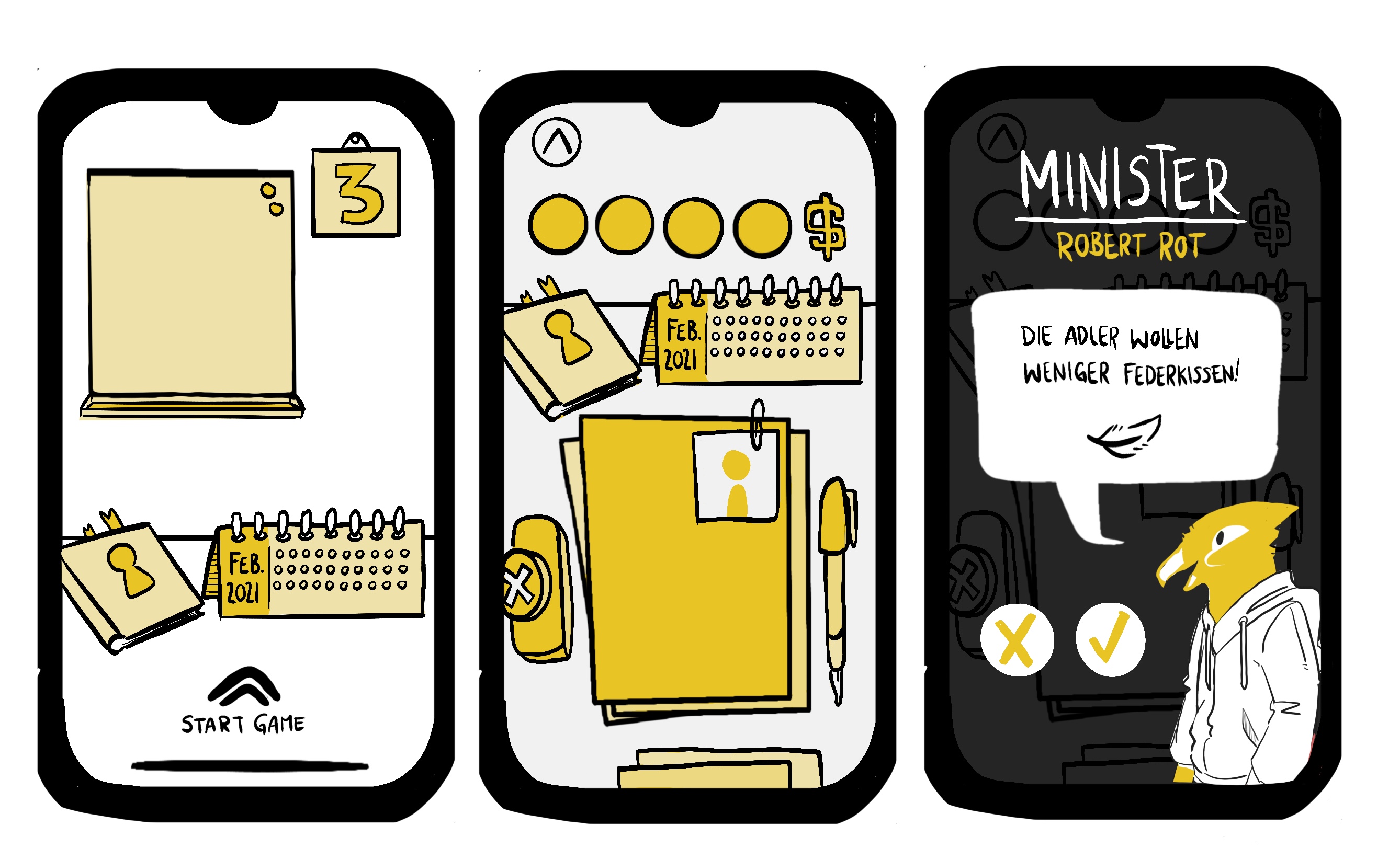
UI sketches for the look & feel
| My position | Game Designer |
|---|---|
| Time frame | May - July 2019 |
| Genre | Casual Mobile Strategy Game |
| Platforms | android and iOS |
| Software | twine, Docs, Sheets, Affinity Designer, Affinity Publisher, Adobe InDesign, draw.io |
| Target group | teenagers from 13 to 18 |
| Other team members | 1 Content Designer, 1 Artist/ UI Designer, 1 supporting professor |
| Company | Harz University of Applied Sciences + Saxony-Anhalt state parliament |
| My tasks |
|
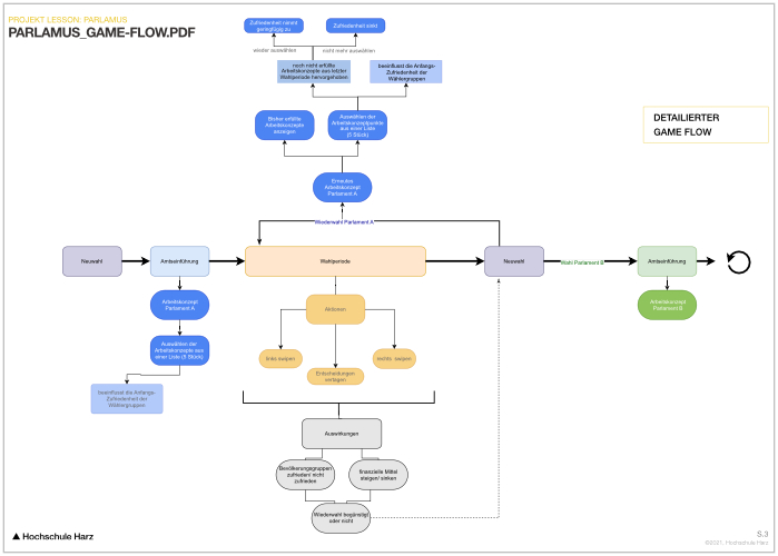
Detailed game flow
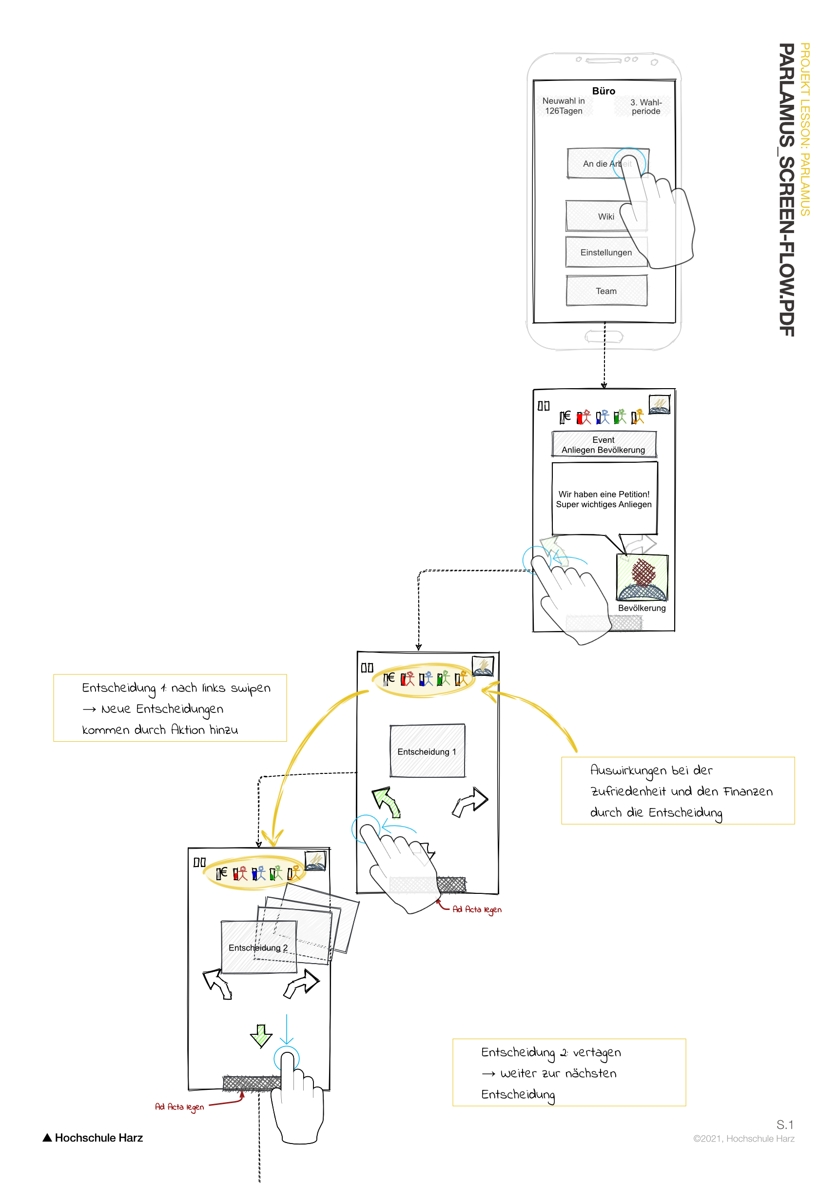
Screen flow showing how the user experiences the different game states.
After multiple phone calls and iterations, we had learned a lot, and our client was satisfied with the result.

Overarching Game Loop

Content design table, showing the different cases, possible decisions and outcomes
Other Projects
Master thesis
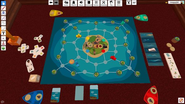
Serious game with the tiptoi®
© Ravensburger AGMaster thesis
Serious game with the tiptoi®
| My position | Game Designer |
|---|---|
| Time frame | May - July 2019 |
| Genre | Casual Mobile Strategy Game |
| Platform | board game + tiptoi |
| Software | Prototype in Table Top Simulator, Affinity Designer, tiptoi tool, Sheets, Docs, draw.io |
| Target group | children from 6 to 10 |
| Project background | Masters' degree: thesis project |
| Other team members | Consulting Game Development Manager |
| Company Cooperation | Ravensburger – Ravensburg, Germany |
| My tasks |
|
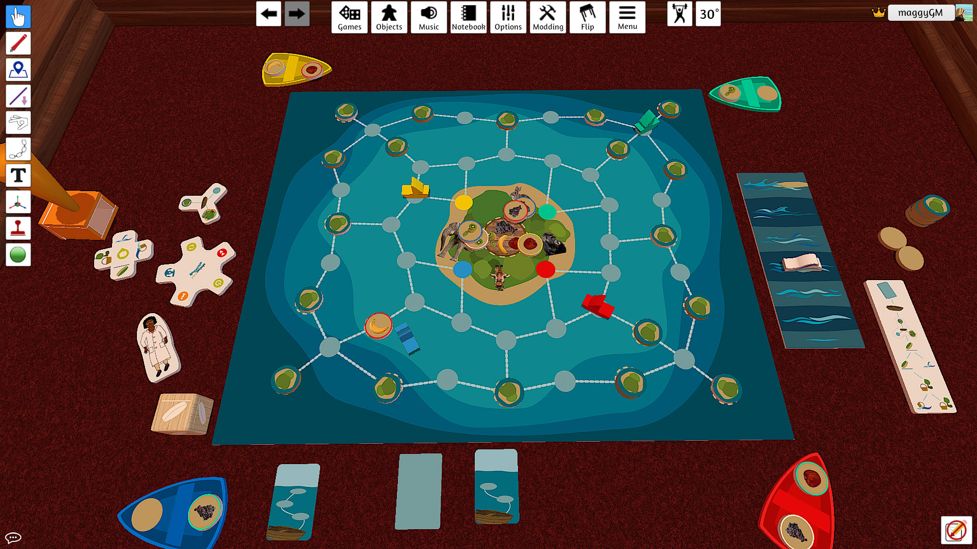
To find the food they have to visit the small islands and on some of them are fruits. Collecting is possible with fulfilling small motoric tasks. But beware of the upcoming storm and never forget on which islands you’ve already been!

The tiptoi is a pen for kids that adds audio to print media.

Some of the possible Game States.
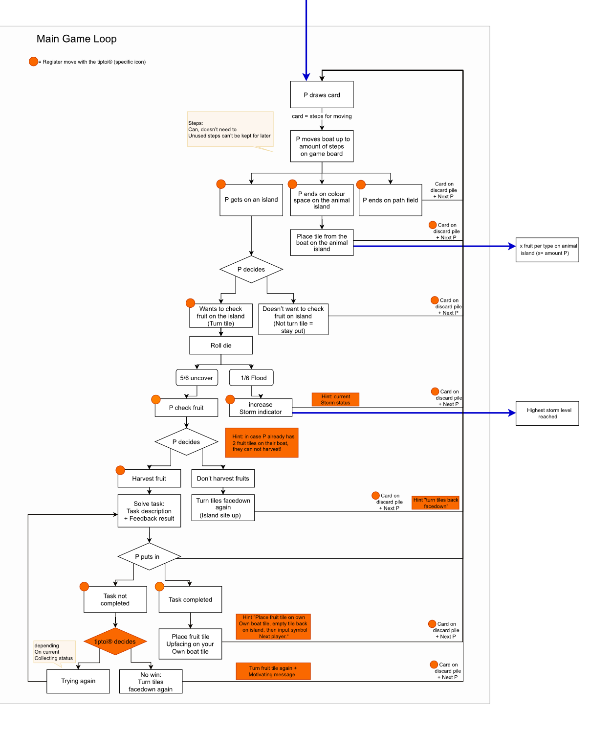
Flow chart for the core game play.

Voice commands and logical references with the point code, that makes it play.
Schau mal

Interactive installation
Schau mal
Interactive installation

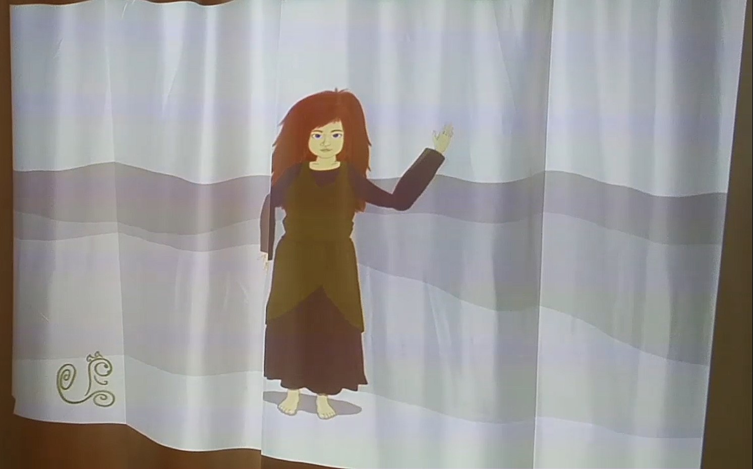
| My position | Designer, Programmer and artist |
|---|---|
| Time frame | October 2016 – February 2018 |
| Genre | interactive installation |
| Platform | windows + Kinect |
| Software | Processing, Adobe Photoshop |
| Target group | by-passers in the city |
| Other team members | 1 helper to set up the installation |
| Project Background | Trier University of Applied Sciences: Main project |
| My tasks |
|
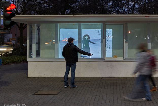
The protagonist Fianna imitates the movements of the pedestrians and thereupon shows her own world. The aim is to make people in everyday life look up and experience the world around them more actively.
This project was my main bachelor's degree project and I developed it on my own. I had enrolled in a course called Installation laboratory and I found it extremely fascinating. In the course we developed our own tiny digital installations and augmented reality projects in processing, a library based on java.
My idea was to have people realise more what happens around them and therefore to pay more attention to their surroundings. Fianna starts to appear as soon as the Kinect tracks a person walking by. Lines appear on the screen and there is movement. When the person then stands still, she fully appears and imitates your movement. The longer you stand there, the more nature around her appears until at one point everything disappears again.
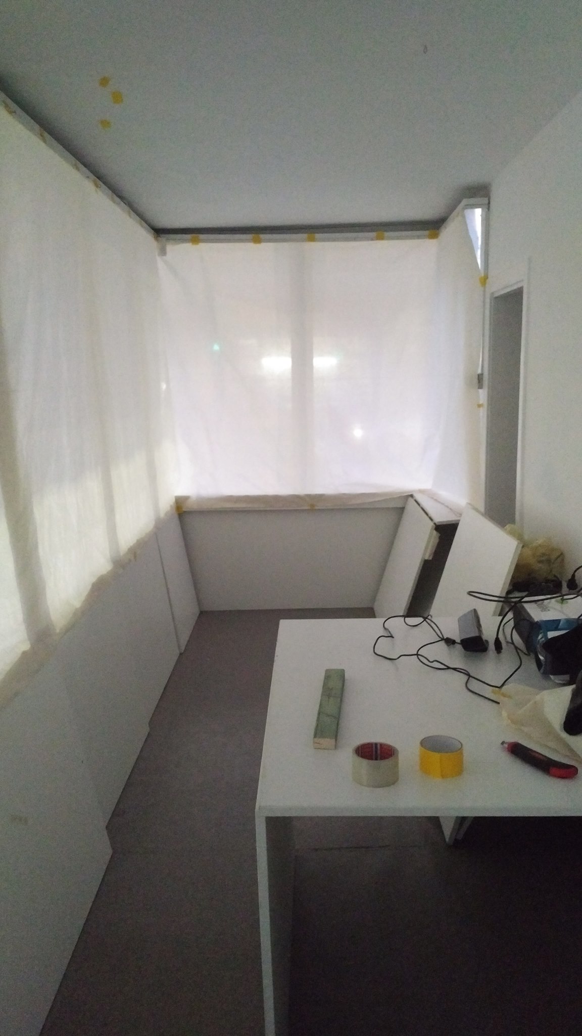
This was the setup from the inside of the Bühne in Trier, a public art space.
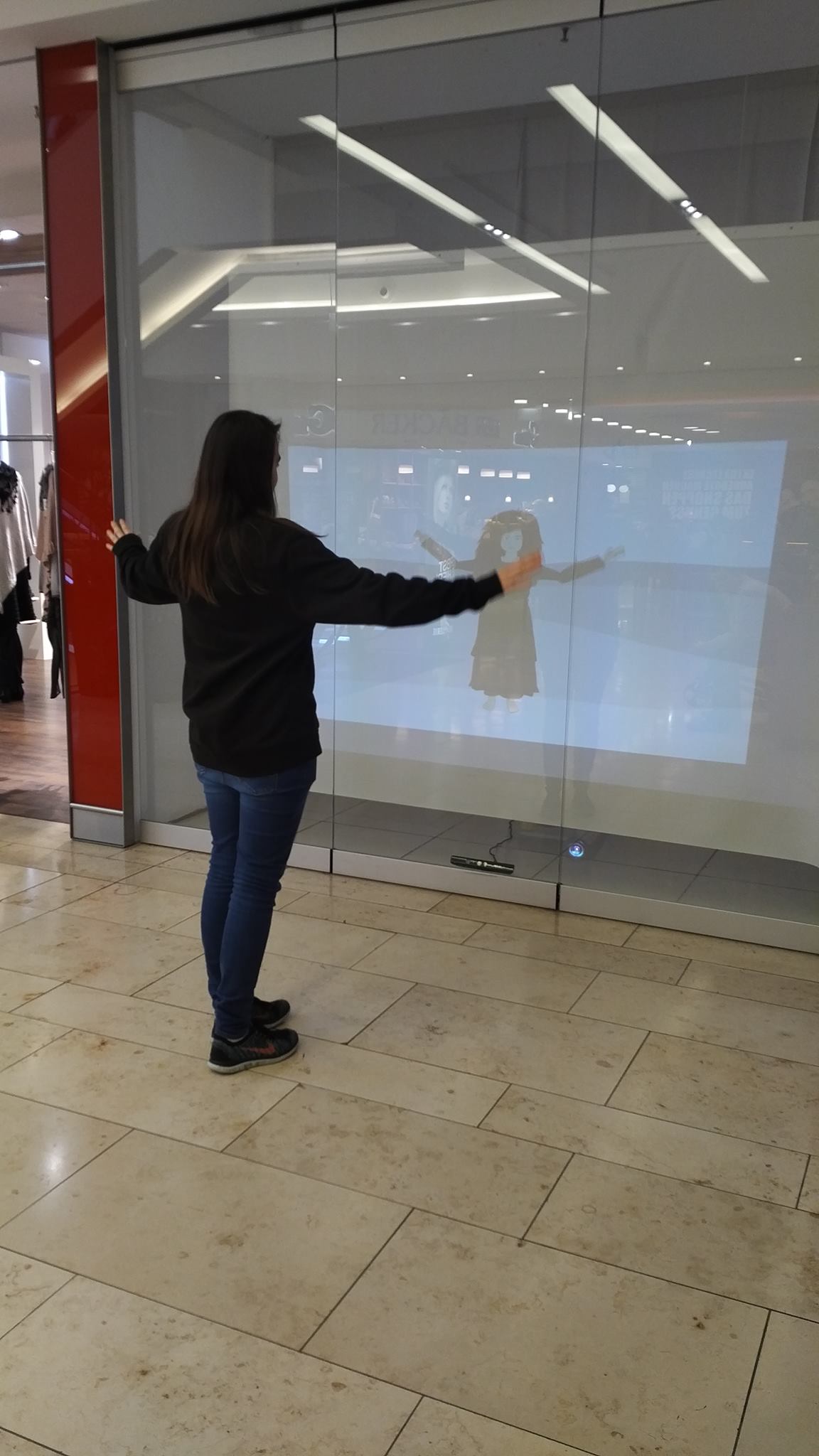
The setup in the shopping mall.
I also made a design for all my materials like posters and handouts.
Overall it was shown over a time of nearly 3 months. The actual idea was to lent it to property owners, who's shop area was currently not in use. Instead of having dark empty or covered windows, I would have liked to see my installation in there. Moving from one window within the city to another, switching weekly.
Unfortunately the acquisition was not that easy, but in the end I was allowed to show it in one of the biggest shopping malls in the city.
I used a small box with stickers for a rough indication on how many people have actually seen it. Fun fact: "Schau mal!" means "Take a look!" in German.
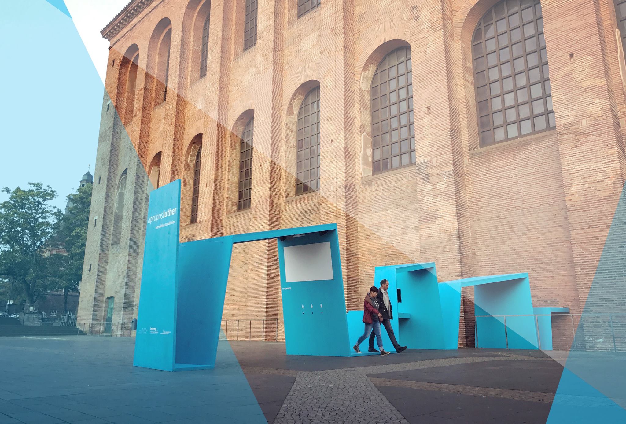
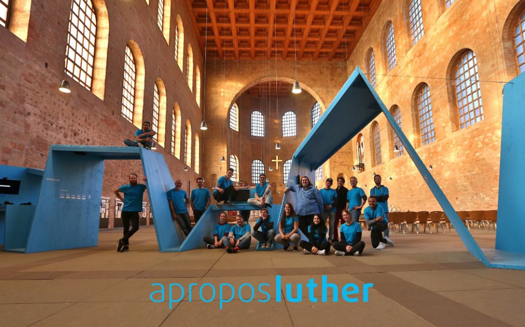
aproposluther
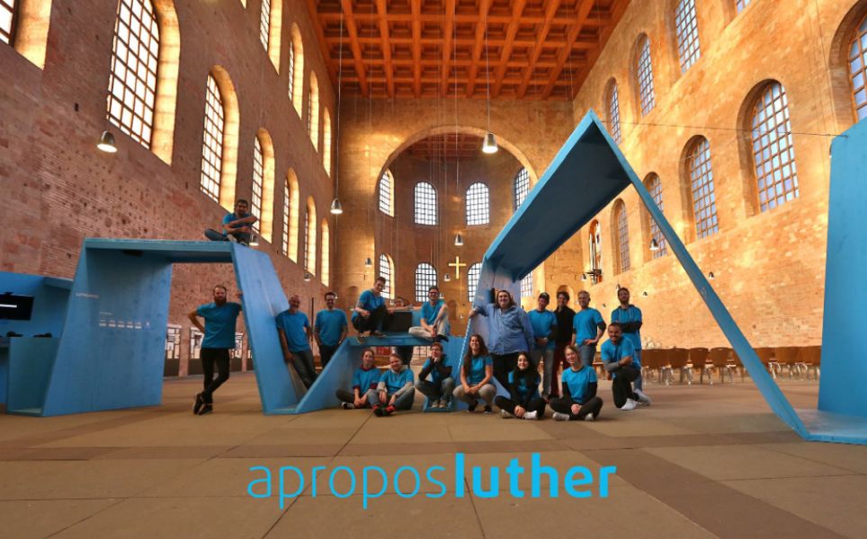
Interactive Luther exhibition
aproposluther
Interactive Luther exhibition
| My position | Experience Designer |
|---|---|
| Time frame | March – September 2017 |
| Genre | interactive installation |
| Platform | Physical installation with multiple digital games and infographic stations |
| Software | SketchUp, Adobe Photoshop, Adobe InDesign |
| Other tools | Loads of Styorofoam, wood and acrylic glass for the models |
| Target group | visitors of the church, young adults |
| Other team members | 40 Students from the degrees architecture, informatics, and intermedia design |
| Project Background | Trier University of Applied Sciences: Installation Design |
| My tasks |
|
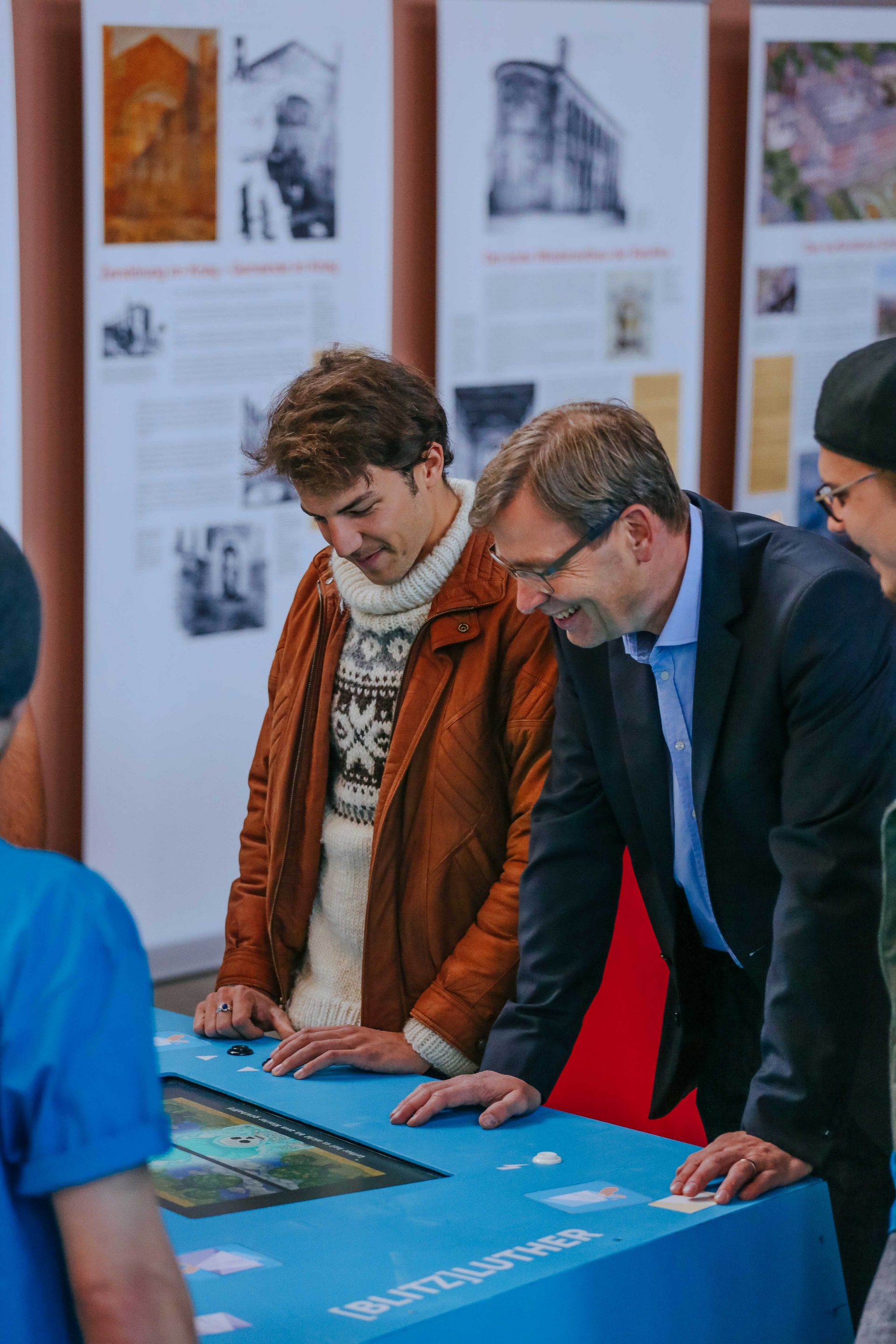
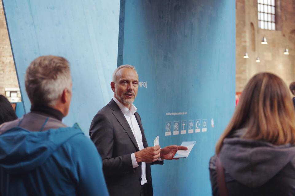
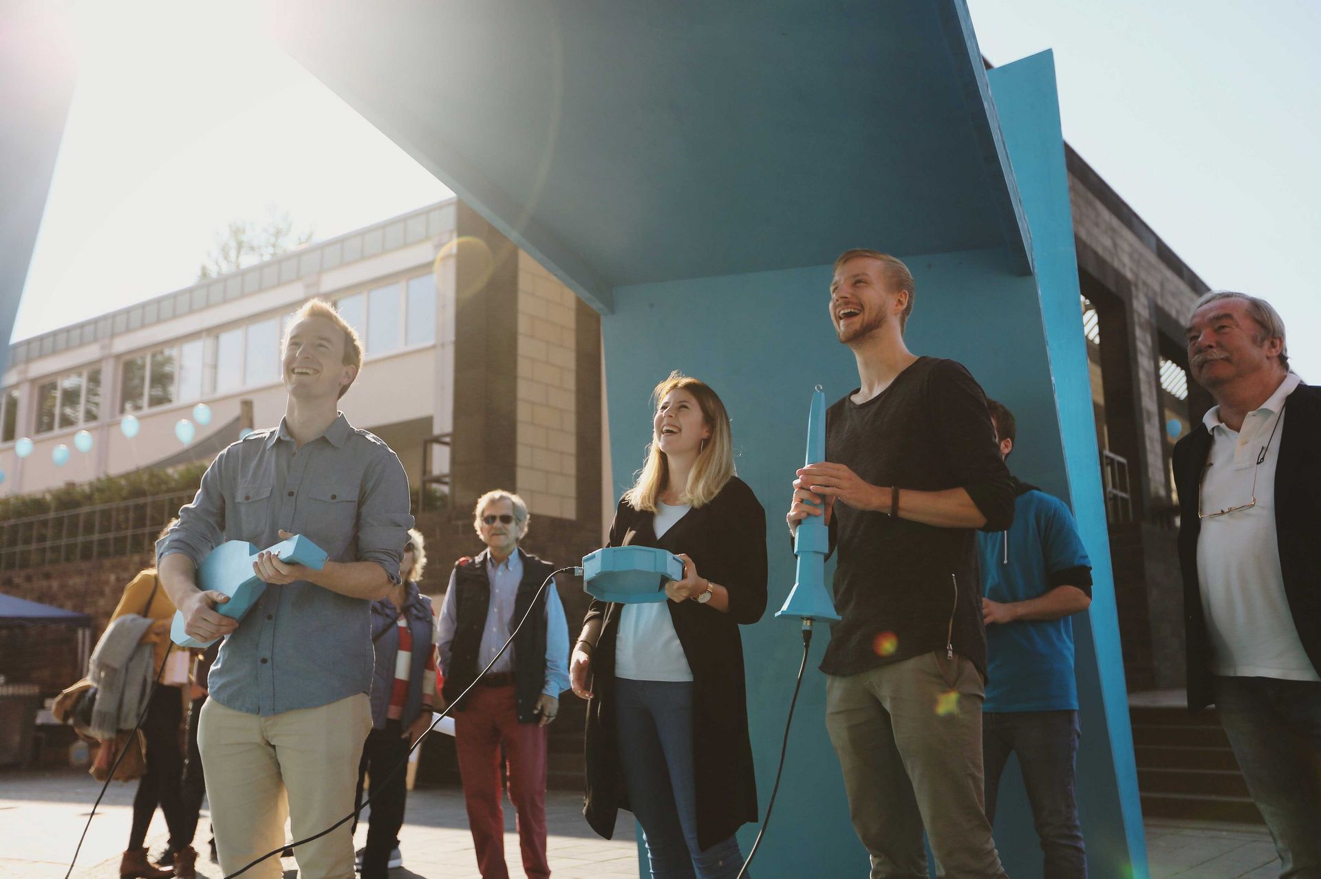
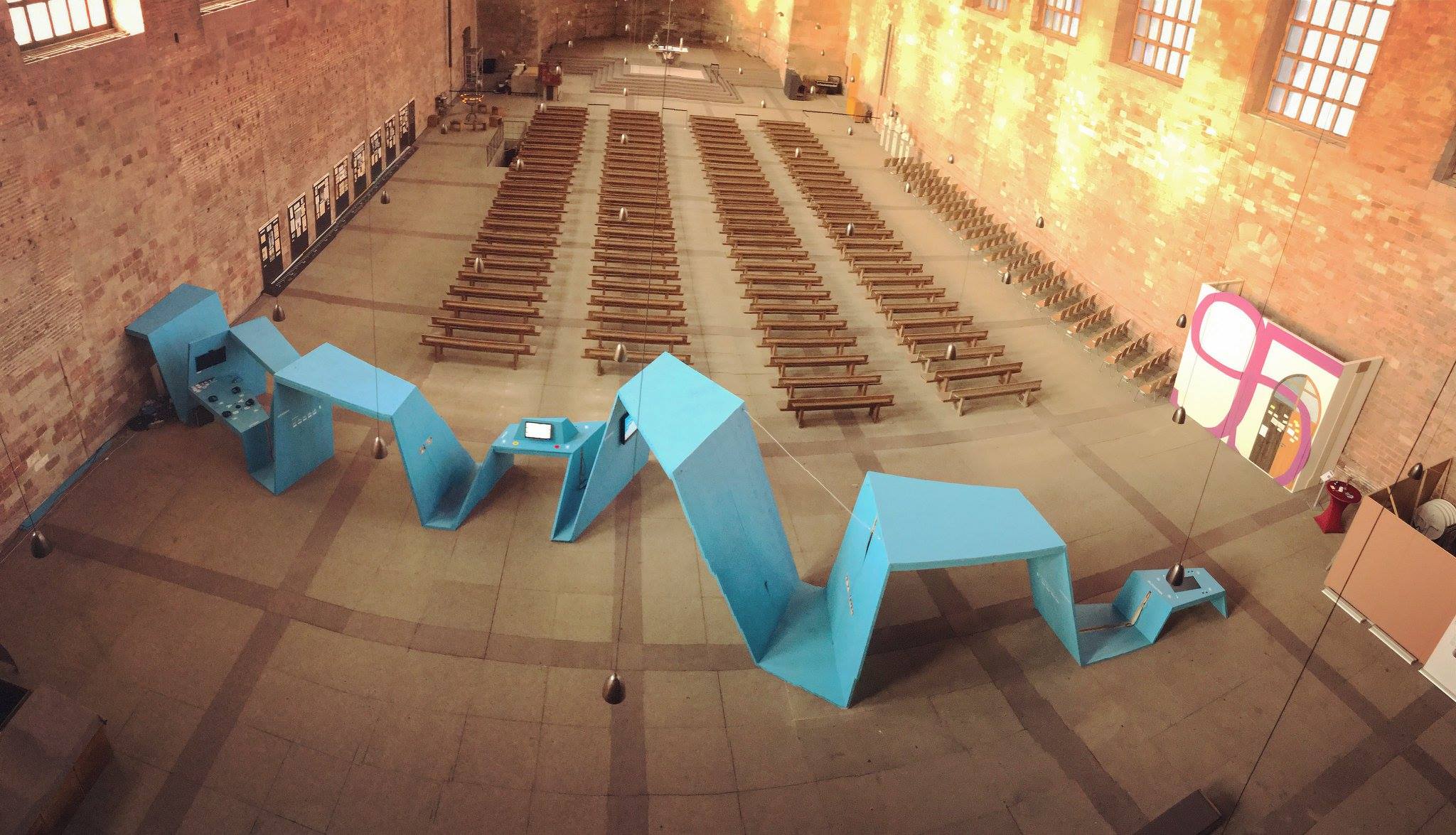
Your Universe
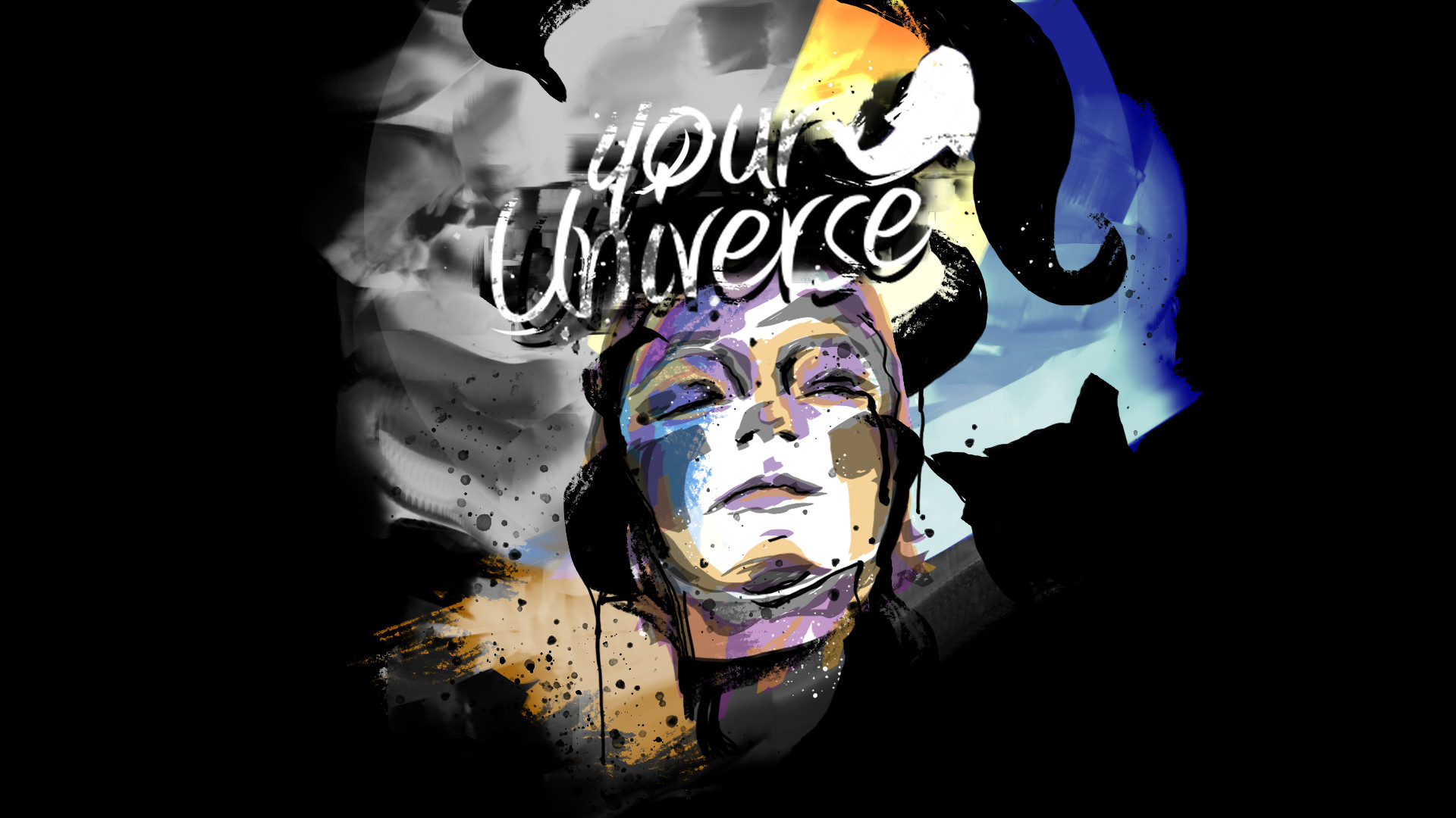
2D Health Game on Depression | Game Jam
Your Universe
Team project
May 2022

We hope that the little fish in this game show that a helping hand or a gesture might bring some more colour or brightness to someone elses life.
My Tasks
- Game Design
- Conncept
- Unity implementation
- UX
Or check out the it the Game Jam page: maggygm.itch.io/your-universe
